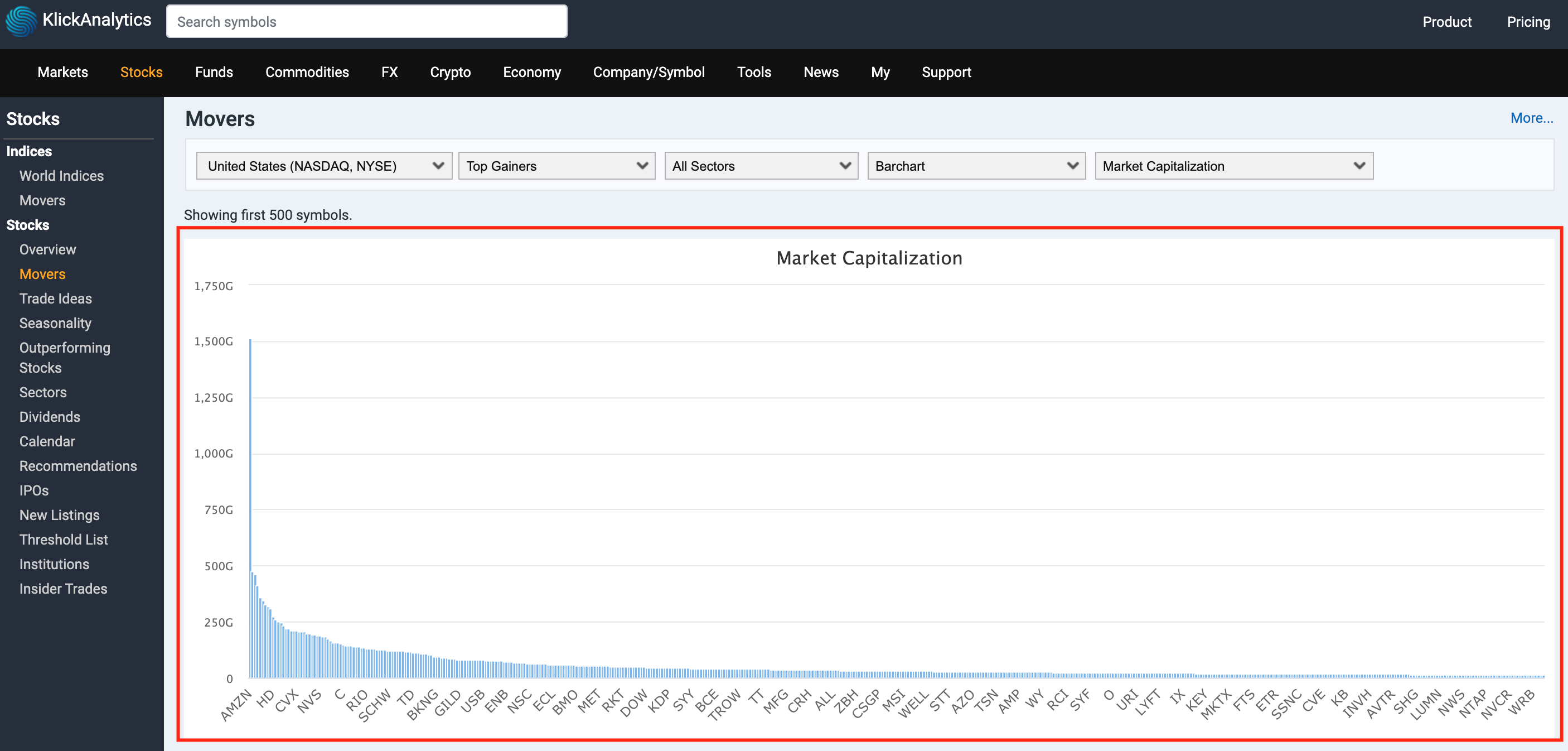
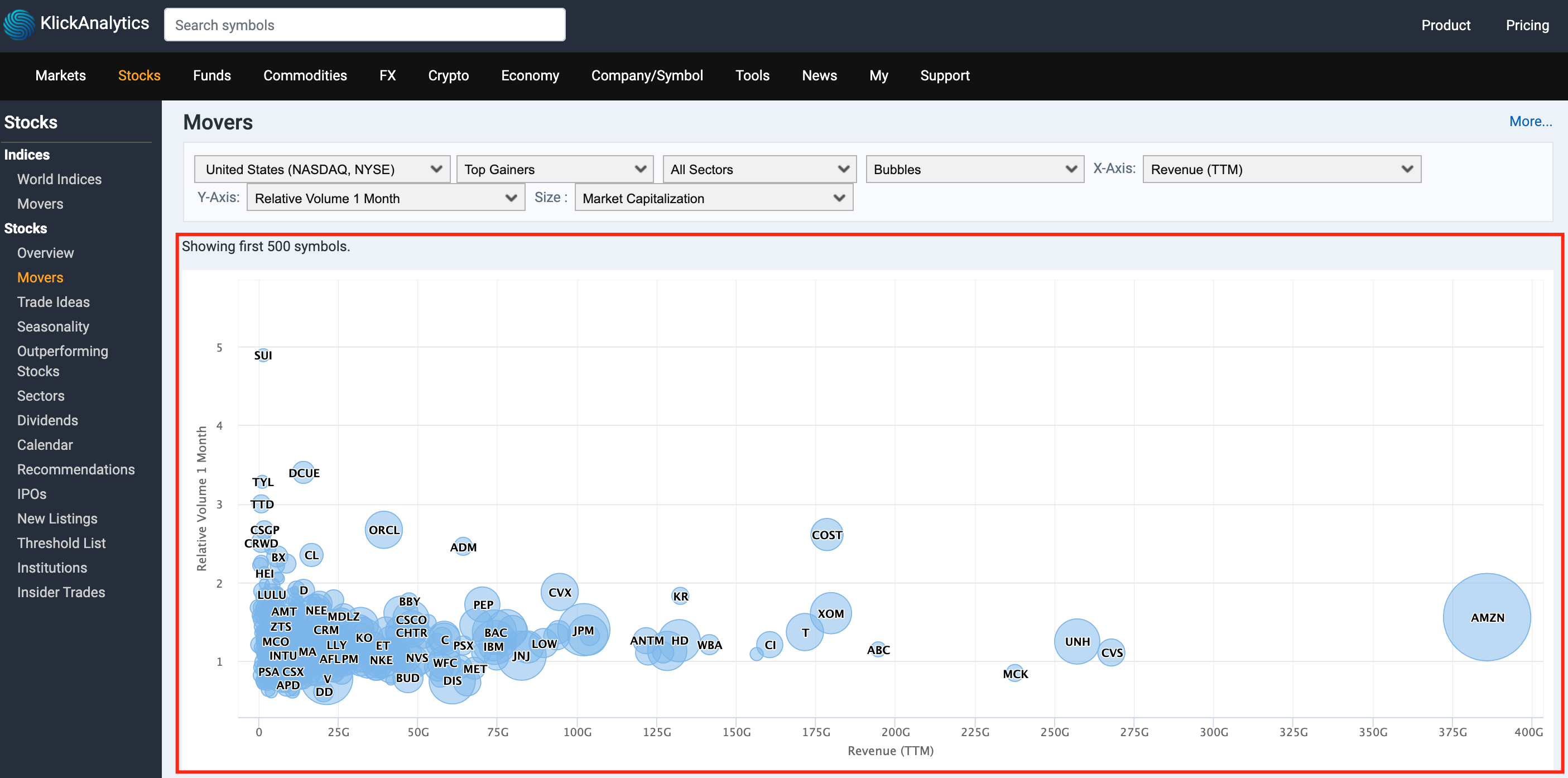
All our tables can turn the data into Barchart and Bubble charts visualizations. This will allow our users to;
View data both in table and visualization formats
Mini charts
Charts - Candle
Charts - Technical indicators
Charts - Interactive
Charts - Barchart
Charts - Bubbles
Charts - Barchart

The Charts - Barchart visualization allows you to view your list of symbols within a table in barchart format. You can select to view 30+ metrics to view the data. e.g. You can view symbols based on Market Capitalization and much more.
Charts - Bubble

The Charts - Bubble visualization allows you to view your list of symbols within a table in barchart format. You will be able to select three financial metrics to draw your bubble chart; the x-value and y-value to position the bubble along the value axes and a third value for its volume. View entire markets prices with market capitalization, relative volume, days returns (%) prices with bubble chart.
Now you can visually check the entire market in charts and more. This feature is enable on all our tables.
To access: From top top menu, select Stock > Movers, and then click on Main Drop Down

